
The “Scientific” Guide to Picking Paint Colors & Sheens
Choosing paint might seem like a quick decision, but at The O’Neill Casa, we know that paint can make or break a room. The right color and sheen bring energy, set the mood, and make your space feel authentically you. We’ve seen it firsthand in projects like our Lake Wylie refresh, where the perfect blend of color and finish brought a gorgeous lakeside kitchen to life. So grab your favorite paintbrush, and let’s break down the fun science of color!

Photo| Julia Fay Photography IG: @juliafayphoto
Step 1: Set the Vibe—Match the Color to the Room’s Personality
Every room has its own unique vibe, and the right color is what brings that to life. Think of it like picking an outfit that makes you feel just right—your room deserves the same love! Is it a relaxed space like a bedroom that craves soft blues and neutrals? Or maybe it’s a more lively area like the kitchen that would rock a warm, earthy tone? In our Lake Wylie project, we set a chill, lakeside-inspired palette—soft neutrals, breezy greens, and soothing blues—that flows seamlessly from room to room and matches the serene view.
Pro Tip: Color is your tool for emotion. For spaces that need to feel cozy, try warm tones; for places where you want to unwind, lean into cooler, more restful colors.
Step 2: Let There Be Light—Understanding Natural & Artificial Light
Lighting is the secret sauce that changes everything! The way a color looks at noon under natural light is totally different from how it feels in the soft evening glow. In our Lake Wylie project’s breakfast nook, for instance, we went with a warmer white to keep things feeling cozy in the bright morning sun. Here’s how we think about light:
Northern Light: Tends to be cooler, so a warm color can add balance and coziness.
Southern Light: Bright and warm, making colors look even warmer. Perfect for whites, blues, and greens that will glow under daylight.
Artificial Light: At night, your lights will pull out either warm or cool undertones. Testing your colors in both natural and artificial light will give you a solid sense of how they’ll look around the clock.
Our Lake Wylie project took full advantage of these principles! We replaced blinds with bamboo shades in the breakfast nook to gently filter the morning light, helping the warm whites stay calm without feeling harsh.
Pro Tip: Test your colors in different lighting conditions before committing. Color changes throughout the day, so make sure it vibes with you no matter the time.

Photo| Julia Fay Photography IG: @juliafayphoto
Step 3: Sheen Selection—Get Sweet with Finishes
Sheen isn’t just about how shiny a wall is. It’s the secret to making paint work hard for you, whether it’s bouncing light or standing up to the wear and tear of life. Here’s a breakdown of the finishes we swear by and where to use them:
Flat or Matte: Like a warm blanket, it absorbs light, hides flaws, and gives a soft, velvety look. Perfect for low-traffic areas like bedrooms or ceilings.
Eggshell: A little more polish with a hint of shine, making it great for living rooms and hallways. Durable but still understated—think subtle and elegant.
Satin: Sweetly resilient! Perfect for spaces like kitchens, bathrooms, or rooms that need a bit of shine and durability without the drama. In Lake Wylie, we used satin for areas that needed a bit more polish but could still handle a splash.
Semi-Gloss & Gloss: Glossy, shiny, and built to last. Ideal for trim, cabinets, and high-traffic zones that need style and easy clean-up. We opted for a gloss in the Lake Wylie pantry, so it’s easy to wipe down without losing its chic look.
Pro Tip: Use flat or eggshell for relaxed spaces and step up to satin or gloss for areas that take a bit more action, like kitchens, bathrooms, and kids' rooms.
Step 4: Keep it Balanced & Simple—Color Combinations That Just Work
Balance is the key to making your space feel cohesive and effortlessly cool. We like to use a three-part combo: a main color, an accent, and a grounding neutral tone. This approach lets each room flow into the next without feeling disjointed.
Our Lake Wylie refresh, we leaned into soft neutrals paired with a dark, moody island to create both depth and a cozy feel that grounded the kitchen. The color palette balanced the open-concept layout, making it feel connected but still distinct.
Pro Tip: Aim for colors that are versatile enough to complement each other, but bold enough to stand out. Don’t be afraid to mix up light and dark tones to create a rad yet harmonious effect.
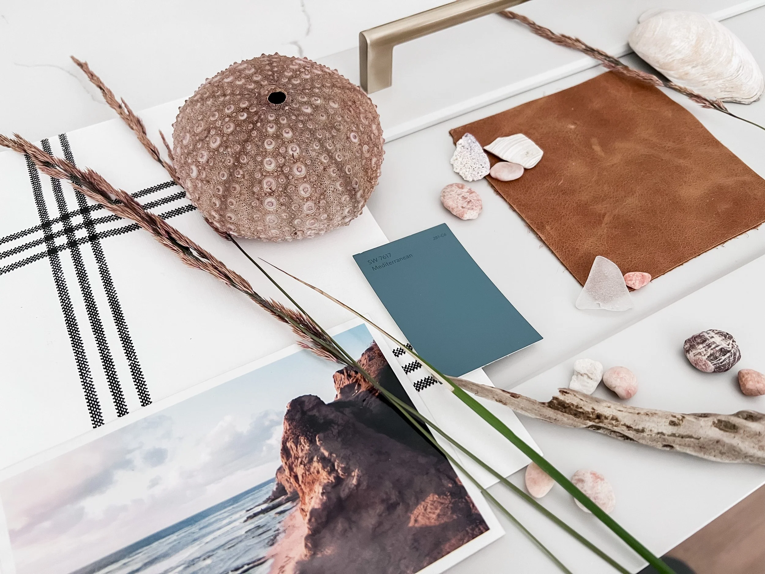
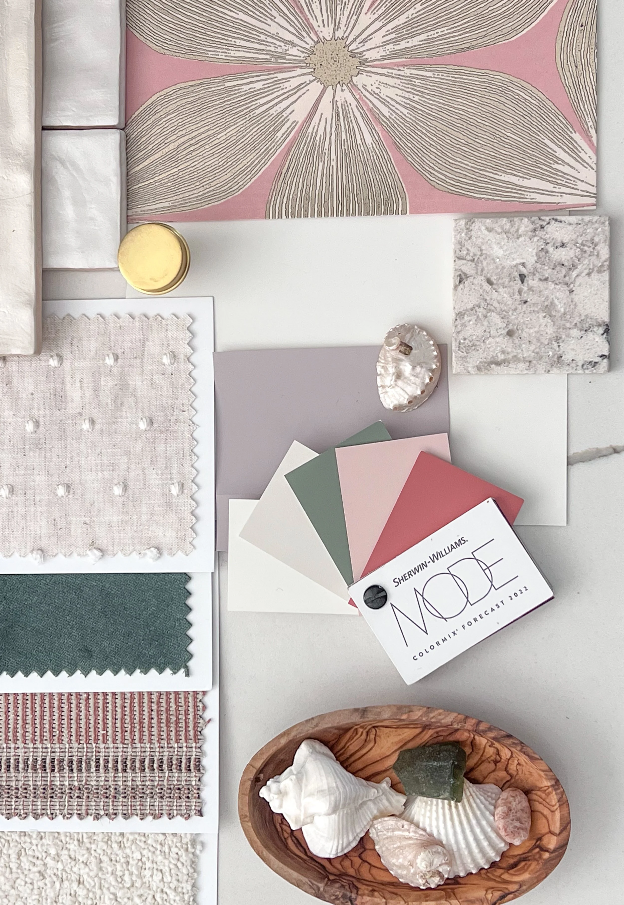
Step 5: Swatch Like You Mean It
Samples are your best friend in this process. We’ve been there: a color looks great in the store, but once it’s on the wall, it doesn’t quite hit the mark. Swatch big, live with it, and see how it looks in different lights. At our Lake Wylie refresh, we tested everything from neutrals to bold blues, ensuring each color worked harmoniously with the views and lighting.
Morning, noon, and night—give yourself time to see how each color behaves before you make the commitment.
Pro Tip: Don’t just test on one wall. Paint a swatch in different areas of the room, and make sure to check it throughout the day. Each wall can reflect color a bit differently!
Photo| The O’Neill Casa IG: @theoneillcasa
The Power of Color—How It Affects Mood and Feelings
Choosing the right color isn’t just about what looks good; it’s about how the room feels. Color psychology tells us that different shades can influence emotions, making a room feel calm, energized, cozy, or even a little luxurious. Here’s our go-to breakdown for creating the vibe you want in each space:
Warm Colors (reds, oranges, yellows): Cozy and happy! These colors add energy and warmth, great for social spaces where you want people to feel welcome and relaxed.
Reds & Deep Corals: Perfect for adding a bit of drama or passion, reds are bold and energizing, making a powerful statement as an accent color.
Oranges & Terracotta: Playful, earthy, and warm. Orange tones create an inviting space, ideal for rooms where you gather with friends and family.
Yellows: Soft yellows feel fresh and optimistic, adding a gentle burst of energy that’s perfect for kitchens or entryways.
Cool Colors (blues, greens, purples): Chill and collected. Ideal for spaces where you want to wind down, think bedrooms or home offices.
Blues: The king of calm. Soft blues bring peace, while darker shades add a rich sophistication.
Greens: Perfect for creating balance. From earthy sage to deep forest green, it’s fresh and grounding.
Lavender & Lilac: Soothing and a bit playful, purples add a gentle sense of luxury that feels both calm and chic.
Neutrals (beige, taupe, grey): Timeless and versatile, neutrals give you a grounded foundation.
Warm Whites & Beiges: Cozy classics. Warm whites give off a soft glow, creating a welcoming vibe in spaces with lots of natural light.
Cool Greys: Sleek and modern, grey tones work well in kitchens or bathrooms where you want a refined feel.
Dark & Moody Colors (deep blue, charcoal, forest green): Luxe and dramatic, these colors create intimacy and depth.
Deep Blues & Greens: Calming and sophisticated. Perfect for making a statement, like an accent wall or a cozy nook.
Charcoal & Black: Bold, mysterious, and modern, darker tones add depth without overwhelming the space.
Photo| The O’Neill Casa IG: @theoneillcasa
Bringing It All Together—The O'Neill Casa Way
At the end of the day, paint isn’t just a detail—it’s a feeling. When you choose the right colors and finishes, you make your home not only look great but feel like a place you belong. By setting the vibe, paying attention to lighting, balancing your tones, and choosing the right sheen, you create a space that’s totally you. So, whether it’s a calm blue for those lake views or a warm terracotta for a cozy kitchen, pick colors that make you feel awesome every time you walk in.